UX/UI

Wave Surfing App 

Real-Time Surf Insights

User Experience (UX) Research

I chose to design and characterize a surfing app, with its main feature being a wave radar that alerts both amateur and professional surfers to wave forecasts and essential data needed for surfing in the sea. A second unique feature is a button that automatically connects to a sports watch, and transfers data from the surfer's session to the app's measurement system. This allows the user to view sessions and a performance graph over different periods, based on their preferences.

Accordingly, a study was conducted on three leading websites/apps in the marine sector to collect relevant information. After that, an application characterization document was created, and real-time sea and wave quality data in Israel were examined and compared between the following sources 

Israeli website: Marine and Ocean Research (IOLR)

4surfers app

MSW Surf Forecast global website/app

The study was conducted using a Samsung S7 mobile phone with an Android operating system.

Data Sources

A comparison was conducted between selected screens, and it was found that none of the apps or websites provide surfers with the optimal set of data required for a complete surfing experience. As a result, surfers tend to rely on multiple platforms to obtain a full picture of the sea conditions.

The global MSW website is the primary source that delivers real-time, accurate data; however, it lacks a clear indication of wave quality, despite being designed specifically for surfers.
The 4surfers app is missing accurate data on water temperature.
The Israel Oceanographic and Limnological Research (IOLR) website is not tailored for surfers, and instead provides general information about sea conditions for the broader public.

Persona and User Flow

A comparison of selected screens was conducted, and it was found that none of the apps or websites provide the optimal data needed by surfers.

As a result, surfers are forced to rely on multiple platforms to get a complete picture of sea conditions.

To support the research process, two personas were created – fictional characters representing different user scenarios, which help us as researchers explore and deepen the research.

Research Method

The research method was qualitative and personal, involving interviews with surfers — both recreational and competitive. The process included questionnaire responses as well as conversations with members of the surfing community about their preferences and needs.

Here are some responses from surfers:

User Reviews

Older users
Older users
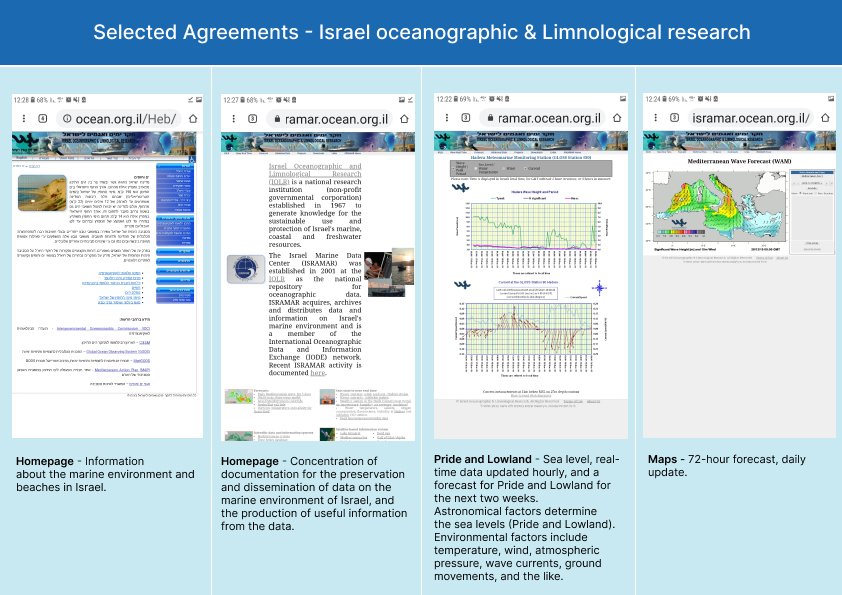
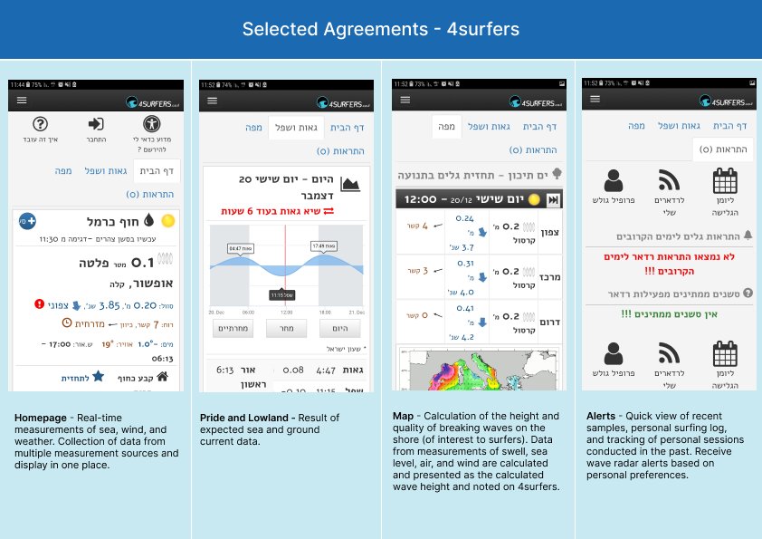
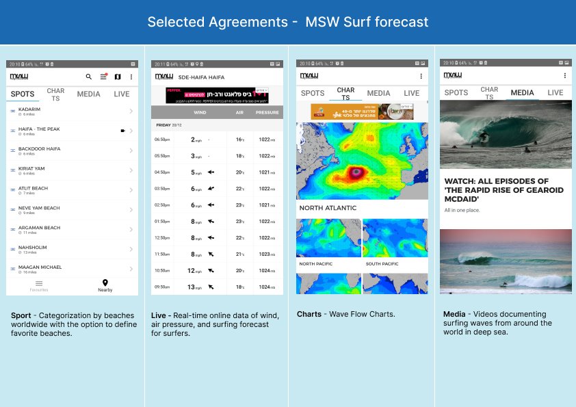
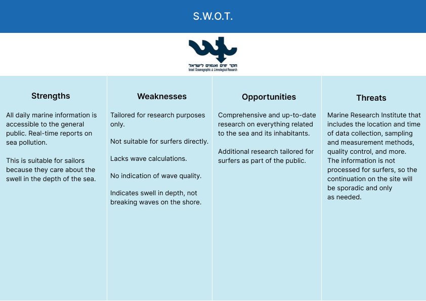
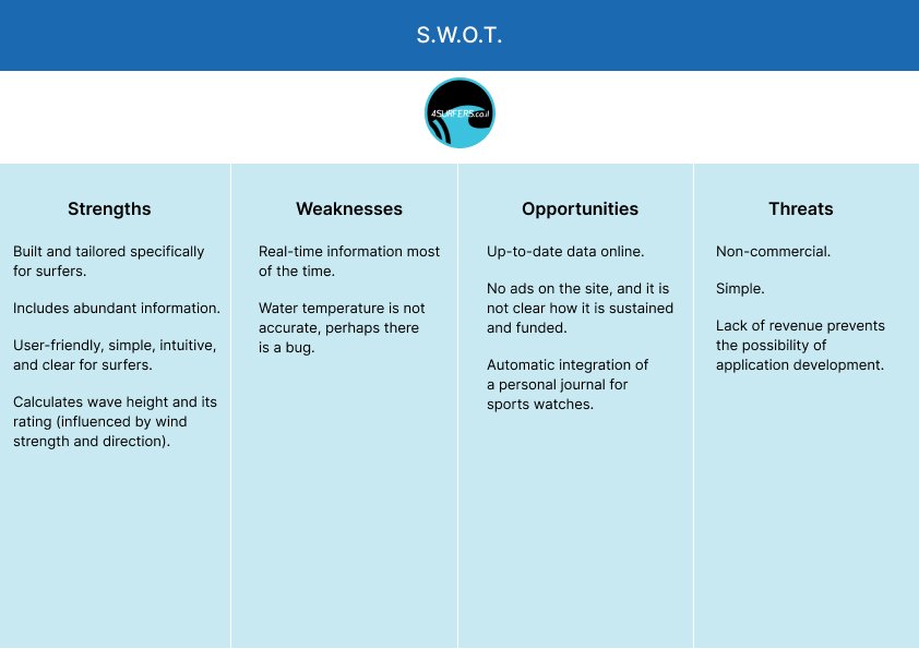
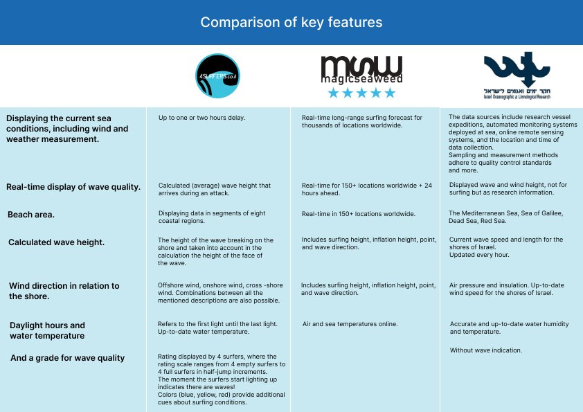
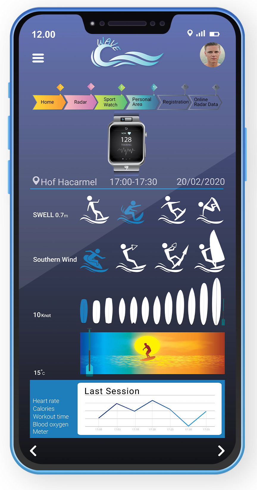
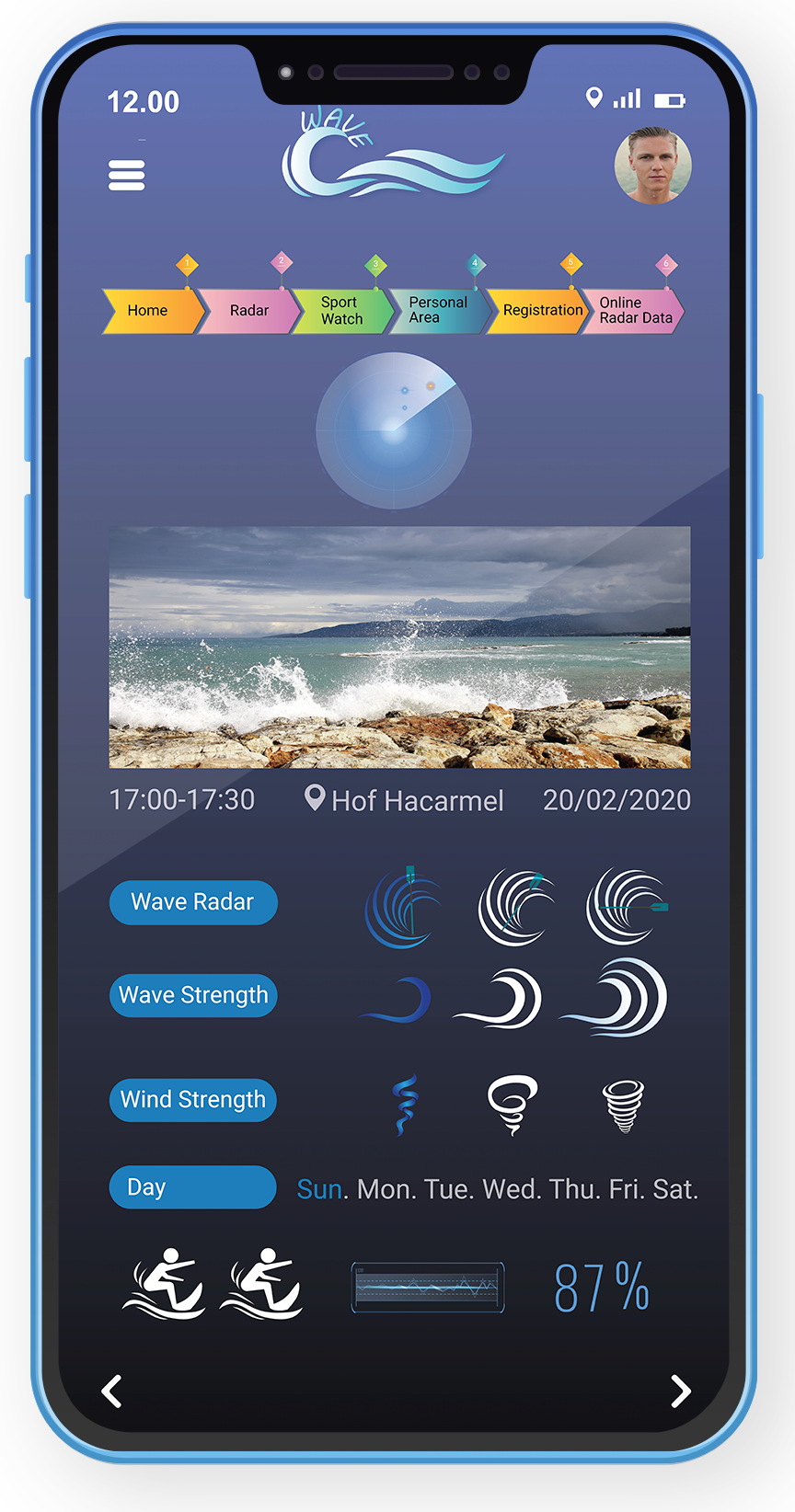
The key parameters that surfers rely on include: Wave direction (how often the waves arrive and how high they are) Beach structure (especially the shape of the seabed - less critical in Israel) Wind - both direction and strength of the wind are critical, as wind can ruin wave conditions or create perfect barrels Tides - While tides and waves have less of an impact in Israel, they are a major factor abroad, where surfers base their sessions on tide data Water temperature 
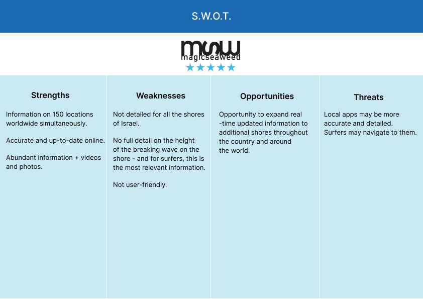
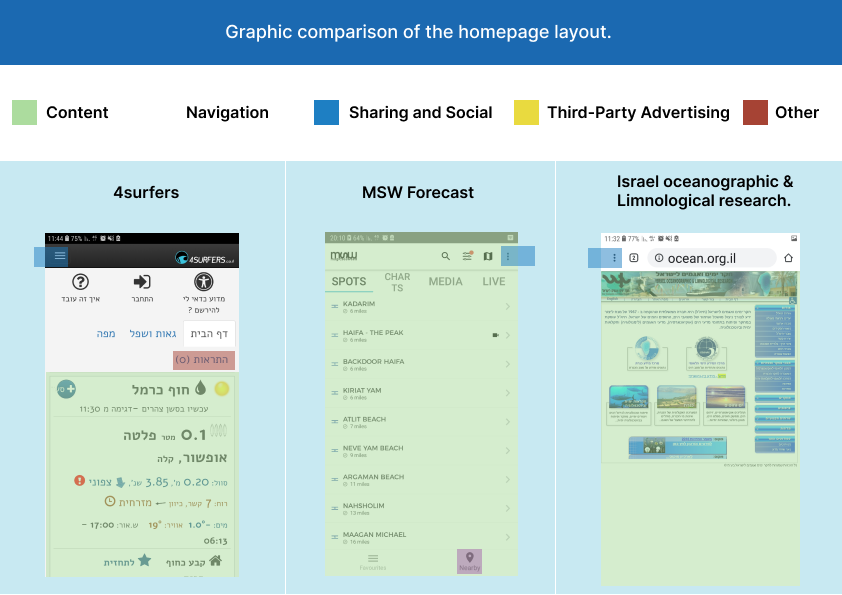
In addition, visual aids are extremely important - such as live beach cameras, photos or videos taken on site. A particularly useful feature, currently missing from all apps, are beach cameras that show the number of surfers, so users can know how busy the beach is before arriving. The real challenge for surfers is knowing when to get to the beach - because once they've already made the effort to get there, the forecast is no longer relevant.
Adults
Adults
Regarding the coastal camera project, the responsibility lies in collaborating with municipal entities or funding businesses along the coast in exchange for advertising on the app. This could lead to expanded capacity for more comprehensive data collection. Some users suggested working with content creators to help provide real-time updates on coastal conditions, along with adding user-generated visual aids such as videos and photos, and free promotion of Facebook pages that post videos whenever there are waves. Others suggested combining an algorithm that combines wind data with wave height, currents, seabed structure, tides, and buoy measurements - an integrated system that would provide future predictions.
נוער
נוער
Some users suggested collaborating with content creators to help provide real-time updates on the state of the beach, along with adding user-generated visual content such as videos and photos, as well as free promotion of Facebook pages that post videos whenever there are waves. As for the project to install beach cameras, the responsibility lies with municipalities or with funding from beach businesses in exchange for advertising on the app. This could expand the ability to collect more comprehensive data. Others suggested adding an algorithm that combines wind data with wave height, currents, seabed structure, tides, and buoy measurements - a comprehensive system that would provide future forecasts.
Experienced surfers
Experienced surfers
Some users suggested collaborating with content creators to help provide real-time updates on the state of the beach, along with adding user-generated visual content such as videos, photos, and promoting free Facebook pages that post videos whenever there are waves. As for the project to install beach cameras, the responsibility lies with municipalities or funded by beach businesses in exchange for advertising within the app. This could expand the ability to collect more comprehensive data. Others suggested adding an algorithm that combines wind data with wave height, currents, seabed structure, tides, and buoy measurements - a comprehensive system that would provide future forecasts.

App Requirements

Comparison of Three Sources

The MSW global website is the main source providing accurate real-time data. However, it lacks a wave quality score, even though it is geared towards surfers.

The 4surfers app lacks accurate water temperature information.

The Israeli Marine and Sea Research website is not intended for surfers, but rather provides general information on sea conditions to the general public.

Visual Comparison and Core Feature Analysis of Three Data Sources

S.W.O.T

In light of the above, a SWOT model was conducted to identify the benefits of the future application, WAVE, with the aim that every surfer looking for an application of this type would find it and continue to use it over time. The conclusions of the new model indicate that the application should ideally integrate most of the following data:

Automatic integration of a sports watch into a surf diary specifically tailored for curious and competitive surfers.

Adding real-time data such as live images, videos and explanations.

Up-to-date sea forecasts regarding breaking waves on the beach, wind directions and water temperature.

UX Decisions

The first step is to create a proper structure for the app – the user flow.

I realized that users tend to be impatient and want information immediately. Therefore, I designed a simple and accessible interface, which includes clear buttons for key functions such as the wave radar and connection to the sports watch. This way, users can quickly access the required information without wasting time on unnecessary searches.

Wireframes

Mapping the system and functions defined in the screen tree to a visual model of the application.

Adding New Features

Screen 4 – Unified Experience:

Unlike other models that focused solely on data, this screen combines all the key features from multiple platforms into a single app, with additional real-time access – even without user registration.

Fifth screen:

A personalized training map showing metrics for each workout.

Sixth screen:

Optional registration feature, not required.

Since registration is not always desirable and may lead to user abandonment, it is offered as an option only. To streamline the process and make it easier for users, registration can be done via Google or Facebook login.

Seventh screen
A personalized training map, which includes a display of various training metrics such as
Training duration: Shows the total time of each workout
Wave count: Shows the number of waves during the workout
Wave length: Shows the average length of the waves
Surf speed: Indicates the surfer's speed during the workout
Energy consumption: Shows the amount of energy consumed during the workout (based on sports watch data)
Physiological metrics: Includes data such as pulse, heart rate or even calories burned – if supported by a connected sports watch
Comparison with previous workouts: Allows users to compare their performance between different workouts and track improvement over time
By displaying these metrics clearly and visually, users can track progress, gain insights into different aspects of surfing and continuously improve their performance

Conclusions

Surfing is close to my heart, and I was able to design an app that provides an improved surfing experience by collecting a wide range of metrics on a single platform. Unlike other platforms that focus on limited datasets, my app provides a complete and holistic picture of surfing conditions.

Through my work with users, I gained valuable insights into the surfing world and discovered ways to improve the user experience. In addition, I recognized the potential for collaborations beyond individual users – including partnerships with municipal entities and beach businesses – to improve the services and experiences offered.

Scroll to Top